
Protecting reputations and driving value.
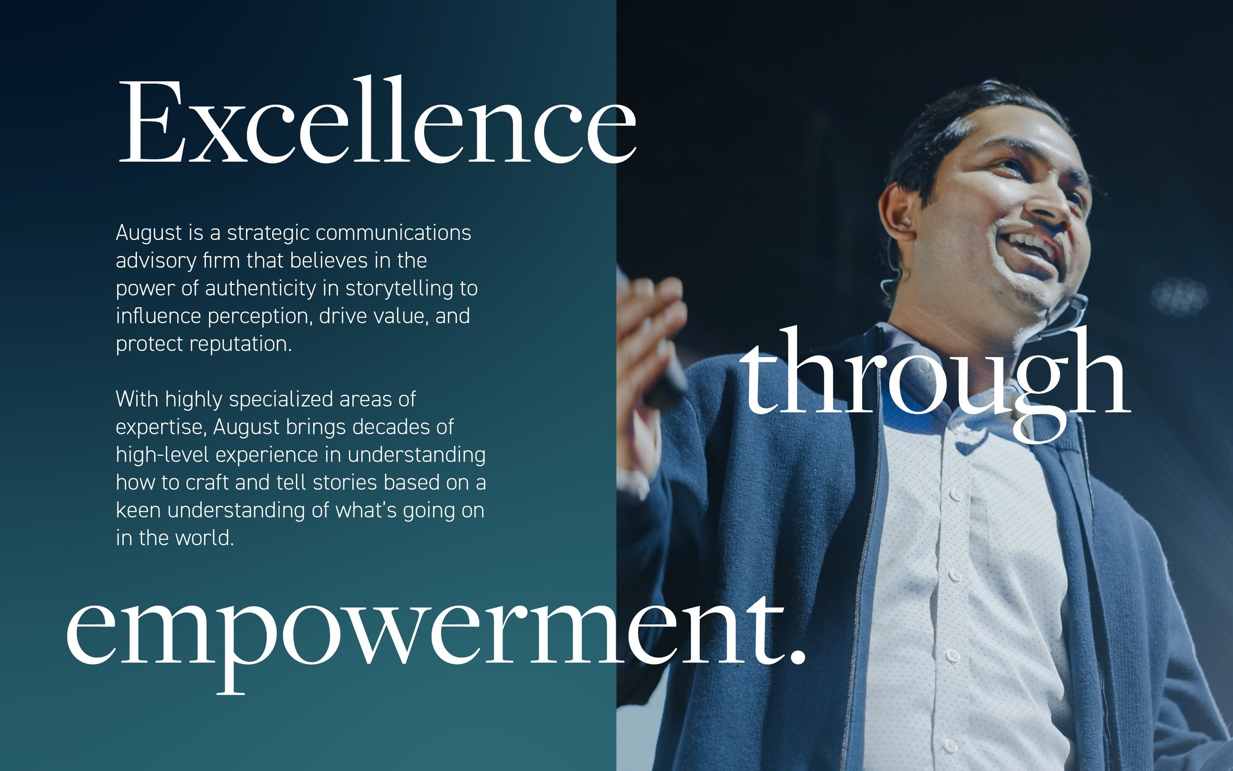
August is a strategic communications advisory firm that believes in the power of authenticity in storytelling to influence perception, drive value, and protect reputation.
With highly specialized areas of expertise, August brings decades of high-level experience in understanding how to craft and tell stories based on a keen understanding of what’s going on in the world.
Inspired by architecture and bridges, our brandmark represents an apogee derived from the proportions of the “A” in August. The apex symbolizes growth while the multiple lines of the structure symbolize the strength of our strategic team. This brandmark is used in a circle with most logo lockups and can also be used as an oversized watermark for subtle yet impactful background graphics.
-
August came to us as a new company with a team of exceptionally experienced partners. We needed to accurately depict their expertise across their brand identity while effectively communicating the differentiating factors they have compared to other strategic communication firms.
-
Inspired by architecture and bridges, our brandmark represents an apogee derived from the proportions of the “A” in August.
The apex symbolizes growth while the multiple lines of the structure symbolize the strength of our strategic team.
Our colors were inspired by Hopper's Nighthawks, which the team felt very inspired by.
-
Naming Advisory
Brand Story & Messaging
Logo & Wordmark Design
Identity System Design
Color System
Type System
Brand Stationery
Brand Guidelines
Collateral Package Design
Company Deck Design
Web Design